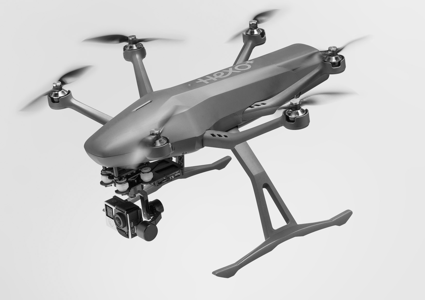
Designing Hexo+ Mobile App (part #1)
A look into the design process for a connected product
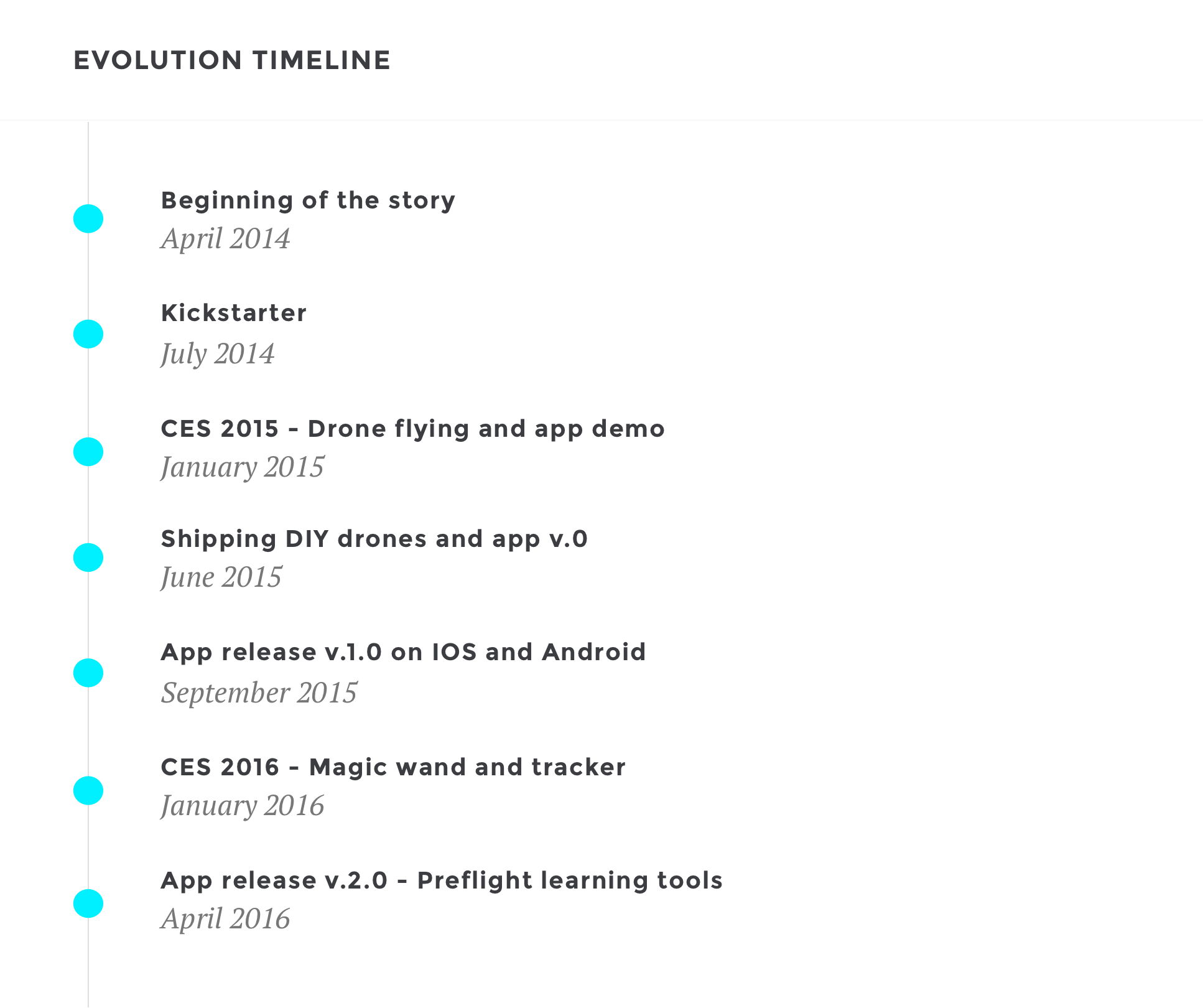
In 2014, Hexo+ developed a working prototype and within six months of the initial idea had raised more than $1.3M on Kickstarter. Now more than 2600 Hexo+ intelligent drones and apps have just shipped all over the world.
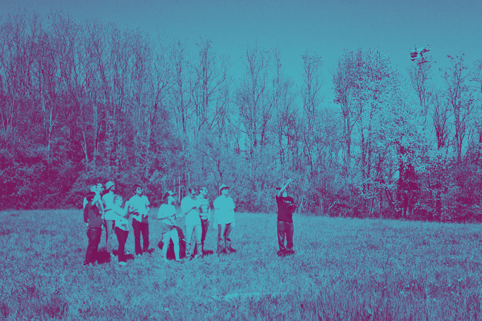
In this article, we’ll provide a sneak peek into our design process for an iconic French startup. We’ll talk about the challenges we faced while designing for a connected product and how it can be difficult to show evolutions or stabilise recommendations.
We’ll highlight how we set the project stage and truly embraced prototyping and evaluation to address outcomes like fund raising and CES. We’ll also point out elements that can serve you as a DIY guide for running your own design process.
We’ll be honest and upfront about some blunders made, and in the comments we’d like you to share some war stories as well.
Setting the stage (part #1)
Building the design team
After Hexo+ success during CES 2015, both software and hardware developers at Squadrone System expressed their needs to have a design team that would help them prototype quickly and get real customer inputs on what works and what doesn’t.
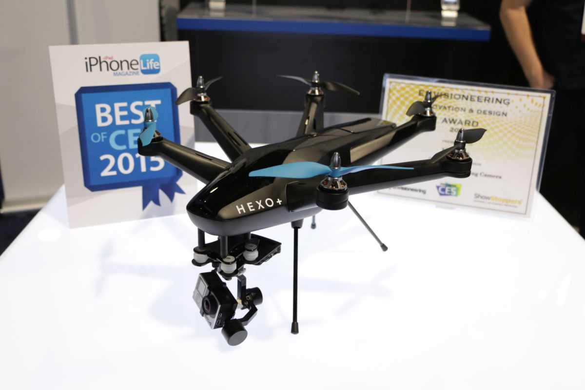
Developers received a good looking UI, first version of the IOS mobile app which even won an award at CES. After this event, no designers were there to define the workflow and behavior screen after screen, describing the best case scenario and challenging edge cases with the team.
So at the end of January we started setting the stage with Yves, developer at Sogilis, and Nicolas, Squadrone’s own talented visual designer. Excited that we were taking the steps toward Hexo+’s next adventure, we started out the project by interviewing freelancers and agencies with the help of at least one software and hardware developer until we found the perfect match.
We were looking for talented people with complementary skills, individuals who push themselves and inspire those around them. We ended up with an amazing team with Damien, 20+ years of experience as an ergonomist at Idenea with a passion for crushing problems and rock-climbing, Olivier, sharp-eyed content strategist at Squadrone with a background in extreme sports, and Léa, super fun creative graphic designer at La Société Secrète. Later on the team was completed with Vincent and Maxime, two inspired branding designers at Silence.
Quick decisions guide the process
Once we had our team all set, we needed to make sure that we had access to the folks who can say ‘yes’ or ‘no’ to our design propositions. In a project as fast and furious as Hexo+, you’ve got to have someone inside the client’s organisation who makes decisions and makes them quickly. The Product Owner (PO) role is crucial.
Eva was our ever-smiling and ever-demanding PO, the key interface between teams throughout Squadrone. She helped us understand the vision of what was to be built. At the end of each design sprint, she reviewed our propositions, narrowed down and made tough decisions, always keeping in mind big outcomes like user testing sessions, Hexo+ DIY kits or Hexo+ first shipping to our 2600+ Kickstarter backers all over the world.
Pinning down the vision and user needs
After gathering our design team and knowing who was the key-decision maker, we needed to understand the big picture of the project. Who was our main target audience and what was the current functional perimeter? For what outcome?
We started our very first sprint by clarifying the vision of the project, gathering information about end users as well as key actors and stakeholders. We created and prioritised user profiles or ‘personas’ to summarise representation of Hexo+ intended users, each profile representing a different kind of audience for the system.
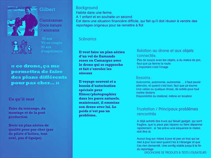
These ‘character sheets’ helped us keeping users in mind all along the project while prioritising a long wish list of design solutions and system features.
Mapping the project
A lot of work defining and prioritising the project was already done when we entered the game, so mapping the perimeter was easy. We read the Product Requirements Document (PRD) and built a Story Map with the team, extracting a Minimum Valuable Product (MVP) focused on an outdoor usage scenario. The first outcome was shipping DIY kits to our 70+ backers and early adopters in June 2015.
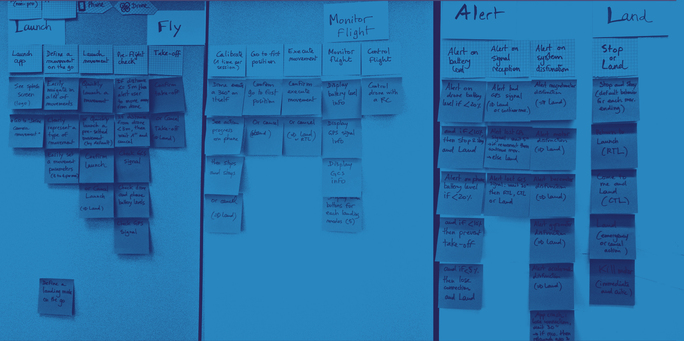
At this stage, we knew that our big challenges would be designing an action oriented interface for an innovative mobile app, respecting both IOS and Android standards while trying to design new ones.
But creating the product backlog was not that easy. Development teams already had one and we tried to centralise information in Jira. In order to avoid communication loss as much as possible, we wanted to share the same tools and methodologies. We started to add design tickets to their backlogs, but soon realised our stories were too high level and understandably not feature-oriented. So we decided to create our own project in Jira and use the same categories so that everyone could find the information they needed throughout the project.
In addition to Jira, we wanted to easily manage our design sessions in a less formal way. As some of us already used Basecamp to manage clients projects, we decided to use that tool to clear our calendars and centralise a whole bunch of design stuff (draft documents, sketches, discussions, user testing videos and feedbacks, to do lists prioritised by iterations). We also opened a Slack for a less asynchronous type of communication, but rarely used it.
With the right people, the right common understanding of what was to be done and a project environment properly set to interact with the development teams, we were on our way to the next successful design sprints.
